Responsive re-design of e-commerce website for Canada’s largest mobility service provider (motioncares.ca) that included extensive discovery work with the client, re-hauling the site architecture, and managing all content migration and development to align with design decisions.
Motion.ca Website Redesign
The Ask.
Redesign the Motion responsive website to align with the business’ shift to more digital touch points with their audience, and champion their expertise and success as Canada’s largest mobility equipment provider.
What would success look like?
What would success look like?
What would success look like?
The bottom line.
After a great discussion with the client during the scoping phase, the team concluded that this project won’t come down to a single measure for success, or sole target. Rather, this work spans a range of tangible focus areas and objectives, which includes:
01
Increasing pages per visit
02
Decreasing bounce rate
03
Increasing time on page
04
Increasing converstion from 1.8 to 3%
Game Plan Workshop
Co-created with client team through InVision Freehand


What makes them special
Motion – and the working group we’ve come to know - isn’t a place. It’s a partnership between clients, their circle of care, and a highly specialized Canadian team of service providers ready to help any person achieve any mobility goal. Compassion and knowledge is what sets Motion apart.
Discovery
5 weeks
What we did
Stakeholder interviews
Audience interviews
Gut Test workshop
Landscape analysis
Content Audit
What we delivered
Interview findings report
Persona boards
Journey maps
Style Tile
Discovery blueprint document
Stakeholder and Audience Interviews
45 minute sessions over Teams
Stakeholder Interviews
We conducted a series of one-on-one stakeholder interviews with members of the Motion team, from individuals from management to technicians/customer support specialists.
These interviews allowed us to get a detailed understanding of what the business aspires to be for their clients and employees, what’s working and not working currently, and what role they envision the website to play in their overall business.
Some major insights included,
💡 Motion is a service company, not a product company.
💡 The website isn’t telling Motion’s story.
💡 Funding is complicated; service requests aren’t efficient.
Audience Interviews
We conducted 2 series of audience interviews from three groups that are instrumental in the mobility equipment purchasing journey: clients, caregivers, and therapists.
Each interview allowed us to gain unbiased insight into the current experience online and offline, which will be used to inform personas, journey maps, and our work going forward.
The interviews provided us more information on,
💡 What matters to them the most.
💡 Their grievances and points of frustration.
💡 Their research habits.
Understanding our users
Consolidated from audience interviews into InVision Freehand

Ideation
8-10 weeks
What we did
Content strategy and site architecture alignment
Design kick-off/brainstorming workshops for each sprint
Created wireframes & high fidelity designs
Regular check-in with client team and iterated on feedback
What we delivered
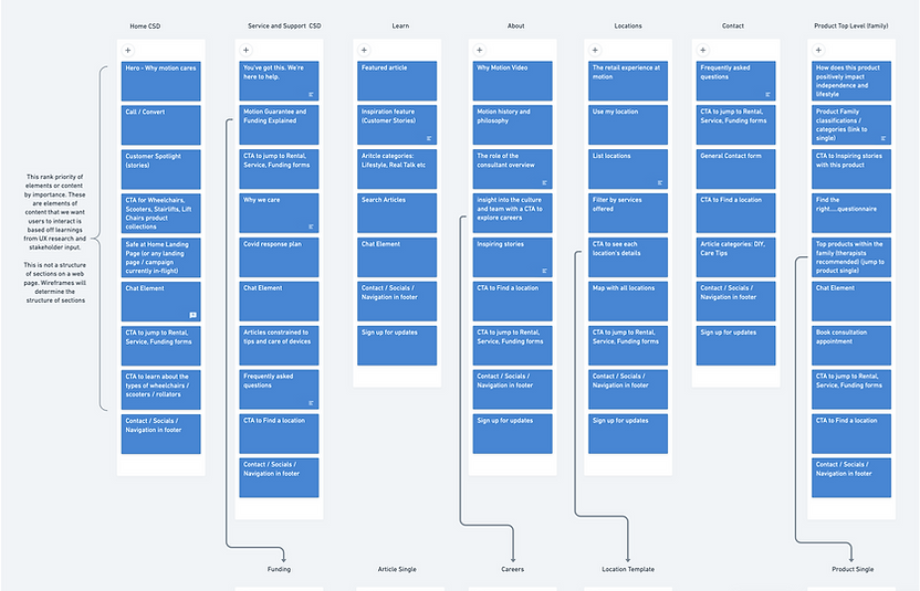
Site architecture
Content strategy (page level)
User flows & site map
Wireframes
Refreshed UI kit
High-fidelity designs
Refining the site structure
Workshopped with strategy team on Whimsical
The main objective of the content audit was to drill down and recommend which existing content items should migrate to the new Motioncares.ca.
We explored the content through a lens of effectiveness; defined by engagement metrics from your Google Analytics view “Motioncares.ca”.

Building maps & user flows
Based on site architecture; Determined design sprint schedule


Wireframes & Designs
Collab brainstorm → Heads down → Review & Iterate → Designs


Experimentation
3 weeks
What we did
Prototyping (on Invision and later on Figma)
Usability testing on all desktop wired screens
Dev walk-through and hand-off meetings
Visual QA
What we delivered
Invision prototype
Figma prototype
Usability testing insight reports
Dev hand off documentation (Abstract)
Prototyping
Wireframe prototype was done on InVision for rapid usability testing. Final designed prototype was created on Figma to add in animation and video elements for the homepage.

Visit the live site: Motioncares.ca
Usability Testing
We conducted testing on mid-fidelity wireframes that were created at the end of every sprint, with 5 testers. Moderated and unmoderated testing depended on the nature of the screens and level of functionality.
